
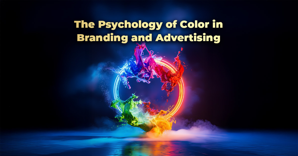
Color is more than just a visual element—it’s a powerful psychological tool that influences emotions, perceptions, and consumer behavior. In branding and advertising, the strategic use of color can make a brand memorable, build trust, and even drive purchasing decisions. Understanding how colors affect your audience is essential for creating impactful marketing campaigns.
The Science Behind Color Psychology
Human brains process colors in a way that triggers emotional responses. Different hues can evoke specific feelings and associations, making color a crucial aspect of branding. Studies show that 90% of snap judgments about a brand or product are based on color alone, demonstrating its significance in consumer decision-making.
Breaking Down Color Meanings in Branding
Each color carries unique psychological connotations, shaping how people perceive a brand. Here’s what different colors commonly represent:
- Red – Passion, excitement, urgency. Used by brands like Coca-Cola and Netflix to stimulate energy and action.
- Blue – Trust, professionalism, calmness. Dominates corporate logos like Facebook and IBM, fostering reliability.
- Yellow – Optimism, cheerfulness, warmth. Brands like McDonald’s and IKEA use yellow to evoke positivity and friendliness.
- Green – Health, nature, growth. Often used by eco-friendly brands like Whole Foods and Animal Planet.
- Black – Sophistication, luxury, power. High-end brands like Chanel and Nike use black for a sleek, premium feel.
- Purple – Creativity, wisdom, royalty. Companies like Cadbury and Hallmark use purple to convey elegance and imagination.
- Orange – Energy, enthusiasm, affordability. Seen in brands like Fanta and Harley-Davidson to create excitement.
- White – Simplicity, purity, minimalism. Apple and Tesla use white to emphasize innovation and clean design.
How to Use Color Effectively in Branding and Advertising
1. Align Colors with Brand Identity
Choose colors that reflect your brand’s personality and message. If you’re a wellness brand, soothing greens and blues might be ideal, while a tech company may opt for sleek blacks and blues to convey innovation.
2. Understand Cultural Differences
Colors hold different meanings across cultures. For example, while white symbolizes purity in Western cultures, it represents mourning in some Asian traditions. Consider your audience’s cultural background when selecting brand colors.
3. Maintain Consistency Across Platforms
From websites to packaging, keeping a consistent color palette reinforces brand recognition. Think of how instantly recognizable the red and white of Coca-Cola or the golden arches of McDonald’s are across all mediums.
4. Use Contrast for Readability and Impact
High contrast enhances visibility and engagement. Dark text on a light background (or vice versa) improves readability, while contrasting call-to-action buttons can drive conversions.
5. Evoke the Right Emotions for Campaigns
Colors influence purchasing behavior. A red “Buy Now” button creates urgency, while a blue background in financial services reassures security and stability.
Transform Your Branding with DMC
The right colors can elevate your brand, enhance engagement, and drive sales. At Dynamic Marketing Consultants (DMC), we specialize in data-driven branding strategies that captivate audiences and boost conversions.
🎨 Want a brand identity that speaks volumes? Let’s craft a visually stunning and psychologically powerful branding strategy for you! Contact us today and make your brand unforgettable.