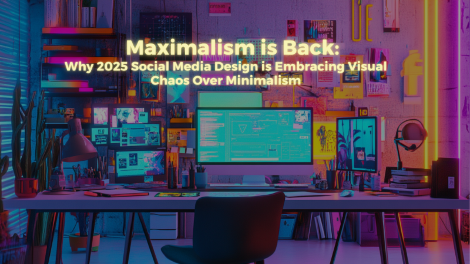
Clean lines are dead. White space is boring. That carefully curated, minimalist aesthetic that dominated social media for the past decade? It’s about as exciting as watching paint dry on a beige wall. Welcome to the maximalism revolution, where more is more, chaos is king, and your Instagram feed is about to look like it exploded in the best possible way.
After years of stark minimalism making everything look like an IKEA catalog, social media design is swinging hard in the opposite direction. We’re talking neon colors that hurt your eyes, layered graphics that defy logic, and visual compositions so complex they require a degree in chaos theory to fully appreciate. The brands winning right now aren’t playing it safe with clean, simple designs. They’re going full maximalist and loving every overwhelming minute of it.
This isn’t just a random trend reversal. There are real psychological and business reasons why maximalist design is suddenly dominating social media, and understanding this shift could be the difference between content that gets ignored and content that stops the scroll. Here’s why visual chaos is the new visual calm, and how to embrace maximalism without losing your mind or your audience.
Why Minimalism Lost Its Magic
Minimalism worked great when everyone else was cluttered and chaotic. When social media feeds were visual disasters, clean and simple stood out like a zen garden in a junkyard. But when literally everyone adopted minimalist design principles, minimalism became the visual equivalent of elevator music. Safe, predictable, and completely forgettable.
The problem with minimalist social media design is that it optimized for the wrong thing. It prioritized looking professional over being memorable, appearing sophisticated over creating emotional impact. When every brand started using the same minimalist playbook, social media feeds became indistinguishable seas of white backgrounds and sans-serif fonts.
Minimalism also assumes people have unlimited attention to give to your content, which is laughably false in the current social media environment. When users are scrolling at lightning speed through hundreds of posts, minimalist design often lacks the visual punch needed to make them stop. It’s like whispering in a stadium full of screaming fans.
The Psychology Behind Visual Chaos Appeal
There’s actual brain science behind why maximalist design is suddenly so effective on social media. Our brains are wired to notice complexity and novelty, especially when we’re in fast-scrolling mode. Maximalist designs trigger multiple neural pathways simultaneously, creating stronger memory formation and emotional engagement than simple designs.
Visual chaos also creates what psychologists call “cognitive fluency disruption.” When people encounter unexpectedly complex visuals, their brains work harder to process the information, which paradoxically makes the content more memorable. It’s like the visual equivalent of a plot twist that forces you to pay attention.
Maximalist design also taps into the psychological principle of “processing fluency,” where the effort required to understand something actually increases its perceived value. When social media users have to spend extra cognitive energy processing your visual content, they unconsciously assign it higher importance than content they can glance at and immediately understand.
How Brands Are Executing Visual Chaos Successfully
The brands nailing maximalist social media design aren’t just throwing random elements together and hoping for the best. They’re using strategic chaos that appears overwhelming but actually follows sophisticated design principles that guide the viewer’s attention through complex compositions.
Successful maximalist design uses controlled chaos, where multiple visual elements compete for attention in ways that create energy without causing confusion. The best examples layer different design elements like typography, photography, illustrations, and graphic elements in ways that feel intentionally excessive rather than accidentally messy.
The key is creating visual hierarchies within the chaos. Even the most complex maximalist designs have clear focal points and logical flow patterns that guide viewers through the content. It’s like conducting a symphony where every instrument is playing different melodies that somehow combine into beautiful music.
The Color Explosion That Stops the Scroll
Maximalist social media design is bringing back bold color combinations that would have been considered garish just a few years ago. We’re seeing neon pinks paired with electric blues, sunset oranges clashing with lime greens, and color gradients so intense they practically vibrate off the screen.
These aggressive color choices aren’t accidents. They’re strategic decisions based on understanding how color psychology works in high-speed social media environments. Bright, unexpected color combinations create immediate emotional responses that make users pause their scrolling, even if just for a split second.
The most effective maximalist color strategies use what designers call “chromatic discord” to create visual tension that demands attention. Instead of harmonious color palettes that blend together seamlessly, maximalist designs deliberately choose colors that clash in visually striking ways that feel energetic rather than chaotic.
Typography That Breaks Every Rule
Maximalist social media design is throwing traditional typography rules out the window and embracing font chaos that somehow works perfectly. We’re seeing multiple font families in single designs, text that overlaps and intersects in impossible ways, and typography treatments that treat words as visual elements rather than just information delivery systems.
The typography in maximalist designs often serves multiple purposes simultaneously. Text becomes both message and visual element, information and decoration, readable content and artistic expression. This approach requires much more sophisticated design thinking than traditional typography approaches.
Successful maximalist typography creates what designers call “typographic rhythm,” where different fonts, sizes, and treatments work together to create visual music that guides readers through complex information hierarchies. It’s like jazz improvisation applied to font selection.
Layering Techniques That Create Depth in Chaos
The magic of maximalist social media design happens in the layering. Instead of placing elements on simple backgrounds, maximalist designs create depth through multiple overlapping layers that build complex visual narratives within single posts.
These layering techniques include overlapping photography with illustrations, combining multiple texture patterns, integrating geometric shapes with organic forms, and blending digital elements with hand-drawn components. Each layer adds complexity while contributing to the overall visual story.
The most sophisticated maximalist designs use layering to create visual depth that mimics three-dimensional space within two-dimensional social media posts. This creates immersive experiences that make users feel like they can step into the content rather than just looking at it.
Platform-Specific Maximalism Strategies
Different social media platforms require different approaches to maximalist design because of varying user behaviors, technical constraints, and cultural expectations. What works on TikTok might be overwhelming on LinkedIn, and Instagram maximalism differs significantly from Twitter maximalism.
Instagram maximalism tends to focus on photographic elements layered with graphic design components, creating complex visual compositions that work well in square and story formats. TikTok maximalism often incorporates motion graphics and animated elements that take advantage of the platform’s video-first format.
LinkedIn maximalism is more subtle, using complex infographic designs and layered data visualizations that feel professional while still embracing visual complexity. Twitter maximalism works within space constraints by creating dense, information-rich graphics that pack maximum visual impact into small formats.
The Technical Challenges of Complex Design
Creating effective maximalist social media content requires significantly more technical skill and design expertise than minimalist approaches. Designers need to understand color theory, typography hierarchy, visual balance, and composition principles well enough to intentionally break rules while maintaining functionality.
File size management becomes crucial when working with complex, layered designs that need to load quickly on mobile devices. Maximalist designs often require optimization techniques that maintain visual impact while ensuring fast loading times across different devices and connection speeds.
The design software requirements for maximalist content creation are also more demanding. Creating complex layered designs requires professional design tools and often involves combining multiple software applications to achieve the desired visual effects.
Measuring Success in Visual Chaos
Traditional design metrics don’t always apply to maximalist social media content. While engagement rates remain important, maximalist designs often generate different types of engagement patterns that require more nuanced measurement approaches.
Maximalist content typically generates higher save rates and sharing behavior because users want to study the complex designs more carefully or show them to others. Time spent viewing individual posts often increases with maximalist designs, even if initial click-through rates might be different from minimalist content.
The most important metric for maximalist design success is often brand recall and recognition. Complex, memorable designs tend to stick in users’ minds longer than simple designs, leading to better brand awareness even if immediate engagement metrics don’t tell the full story.
The Business Case for Embracing Visual Chaos
Beyond just looking different, maximalist social media design delivers measurable business advantages for brands willing to embrace the approach strategically. The increased memorability of complex designs translates directly into better brand recognition and recall among target audiences.
Maximalist designs also tend to generate more organic social sharing because they provide users with visually interesting content worth sharing with their own audiences. This viral potential can significantly amplify content reach without additional advertising spend.
The differentiation value of maximalist design is particularly strong in industries where most competitors are still using minimalist approaches. Being the only maximalist brand in a sea of minimalist competitors creates immediate visual distinction that can drive competitive advantage.
How to Start Your Maximalist Journey
Transitioning from minimalist to maximalist design doesn’t require throwing out everything you know about good design principles. The most successful maximalist approaches build on solid design fundamentals while adding layers of complexity and visual interest.
Start by adding single maximalist elements to existing designs rather than completely overhauling your entire visual approach. This might mean incorporating bolder color choices, more complex typography treatments, or additional layering elements while maintaining overall design coherence.
The key is building maximalist design skills gradually while testing audience response to increasingly complex visual approaches. Monitor engagement metrics and audience feedback to understand which maximalist elements resonate most with your specific audience.
The Future of Visual Complexity
Maximalism in social media design represents more than just a trend reversal. It reflects fundamental changes in how people consume visual content in increasingly fast-paced digital environments. As attention spans continue to fragment, visual content needs to work harder to create immediate impact.
The future likely holds even more sophisticated approaches to visual complexity, potentially incorporating augmented reality elements, interactive design components, and personalized visual experiences that adapt to individual user preferences and behaviors.
The brands that master maximalist design principles now will have significant advantages as social media platforms continue evolving toward more immersive, visually complex content experiences.
Minimalism had its moment, but that moment is over. The social media design landscape is embracing complexity, celebrating visual chaos, and rewarding brands brave enough to stand out in crowded feeds. The question isn’t whether maximalism will continue growing. The question is whether you’ll adapt quickly enough to take advantage of this visual revolution.
Ready to ditch the white space and embrace the beautiful chaos? Your audience is waiting for something worth stopping their scroll. Give them visual complexity that demands attention, creates emotional impact, and makes your brand impossible to ignore. In the maximalist revolution, more really is more.